


IT'S A QUEER OLE YEAR:TV
SHOWS TO WATCH IN 2018
BY ISOBEL MOORE
BY JESSICA BROADBENT
BY JESSICA BROADBENT
LESBIANS: GOING BEYOND
THE QUIBBLES
BY CHESKA HARDIE
BY BILLY WELSBY
BY BILLY WELSBY
BY ISOBEL MOORE & BILLY WELSBY
BY ISOBEL MOORE & BILLY WELSBY
BY CHESKA HARDIE
BY ISOBEL MOORE
BY ELLA JELLYMAN
WEBSITE ANALYSIS

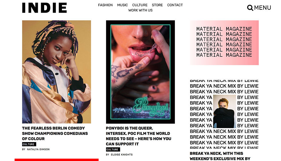


Like: the overall layout and simplicity of headings. It’s bold, clear and concise. Simple to navigate and aesthetically pleasing.
Like:The structuring of the homepage and the visuals / moving imagery.
Dislike:Navigation isn’t very clear and although I like the overall structuring the home page is quite busy, there’s a bit too much going on.


Like: Like indie magazine, them.us has a certain simplicity, and a blog-like layout. It’s bold, clear and concise. Simple to navigate and aesthetically pleasing. The colour changing background makes a change to the usual white backdrop.
Like: Mainstream fashion magazine sites such as Vogue, Elle and Harpurs Bazaar are all pretty similiar in font, layout and simplicity. While they're all aesthetically pleasing they don't have the edge that Indie and them.us harbours.


which elements did i use?
For the design of the X, Y, Z site, I mainly focused on them.us and Indie Magazine, as their whole layout and what were they were about seemed the most fitting for what we wanted to create. I took certain features from the two, and essentially combined them. It mostly consisted of the foundations of Indie Magazine, with minute elements from them.us; such as part of their colour scheme, their blog-like tendency, and their 'tell your story' element.


Following elements such as:
- Indie magazines typeface
- them.us and Indie's font
- them.us' colour scheme- a millennial pink was chosen to reflect the chosen target market.
- Slideshow elements from Vogue
- Indie's overall website layout, from homepage, to articles / interviews.
- Indie's subheadings
-Indie's cover designs - example can be shown left and my take on it can be seen below.
As outlined above, it was through a combination of them.us and Indie magazine,that I curated our website. See below for an overview of the website.


